Have you ever walked into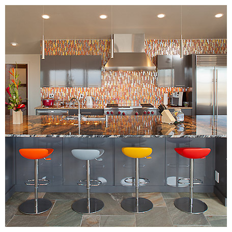 a friend’s home and felt instantly at ease? Maybe you couldn’t quite put your finger on it, but something about the space allowed the stress of the day to just roll off your shoulders.
It’s been scientifically shown that a room’s colors and textures can dramatically affect our mood, feelings and emotions. All it takes is the wrong color paint, and getting home after a long day could make you feel worse rather than better.
That’s why it’s helpful to keep a few basic rules in mind when redecorating.If your favorite room needs a face lift, these tips will help you incorporate vibrant colors with the right balance of textures to achieve the desired feel.
Resist the rainbow. Reducing the number of colors in a design makes a space feel more consistent. Limit yourself to one main color, and two or three accents. Small spaces should use light colors because dark colors can make the space seem smaller. Large spaces benefit most from warm, rich colors that give a feeling of coziness. And don’t worry if you’re not quite ready to let go of your neutral-colored walls: It’s easier to update colorful accessories to refresh your space as the seasons change or as your tastes become better refined.
Be particular about patterns. A pattern acts as a visual texture. Patterns are perfect for adding visual interest, even in a tiny space, just don’t go overboard. Two or three different patterns is more than enough for once space. When choosing patterns, think about both contrast and coherence. Perhaps a simple checkered pattern that matches the color in a large floral print. Remember that small-scale patterns are better for small spaces, while large-scale patterns work in large spaces because it draws the space in.
Opposite textures attract. A lack of complementary textures is a common theme in many self-decorated homes. This is unfortunate because varying the textures in a room can add interest and warmth. Explore the nature of different textures — plush, smooth, rough, woven — and look for opportunities to create depth by layering. You can choose striking textures in bold colors that will elevate your design, or keep the colors neutral but rev up the warmth of a room through the display of many interesting textures. Remember that heavy textures tend to “eat” space, so reserve them for large rooms or spots you want to feel particularly cozy.
While they’re important guidelines, these rules of thumb don’t guarantee that the finished product will match what’s in your head. If you’re overwhelmed by all the choices, never hesitate to reach out to a local designer who can ensure that your favorite room always says, “Welcome, let’s relax!”